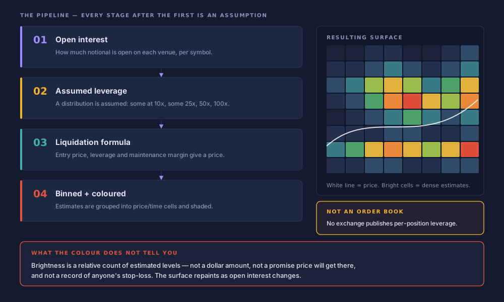
A liquidation heatmap is a picture of where leverage probably sits. That is the entire claim. The CoinGlass liquidation heatmap does not show resting orders, does not show anybody's stop-loss, and is not a feed from an exchange risk engine. It is a model: open interest goes in, an assumption about how much leverage traders are running gets applied, margin arithmetic produces price levels, and those levels are binned and coloured.
That sounds pedantic until you move a stop because a band looked bright. The bands are estimates with a stated error range, drawn from data the exchanges themselves throttle before any aggregator sees it. CoinGlass says so, in language most readers scroll past.
Everything below was checked against the live CoinGlass pages on 27 July 2026. For the wider context on what derivatives dashboards measure and what they infer, start with our field guide to crypto derivatives data. This page is the deep read on one chart.
What the CoinGlass liquidation heatmap actually shows
It shows the estimated concentration of forced-liquidation price levels across a price axis and a time axis. CoinGlass frames it as the accumulation of potential liquidation points and their concentrated areas, derived from trading volume, leverage usage and related indicators. Elsewhere the company is blunter: algorithms predict liquidation concentration zones, and colour intensity signals predicted density. The operative words are potential, predict and estimated.
What it does not show is equally specific. Not a leaked order book. Not which traders hold which positions. Not stop-loss orders, which live on exchange servers and are never published. And never a guaranteed dollar amount that changes hands if price reaches a level.
Measured versus modelled, at a glance
- Measured
- Aggregate open interest per venue, and the price series.
- Assumed
- How that open interest spreads across leverage tiers.
- Calculated
- Liquidation prices, from maintenance-margin rules and position sizes.
- Presented
- Binned into cells, coloured by relative count of estimated levels.
The sentence to remember
A liquidation map is an estimate, not a leaked order book. Exchanges publish neither entry price nor leverage per position, so nobody — CoinGlass included — knows where the real levels are.
How it is built: four stages, and three of them are assumptions
The pipeline has four stages, illustrated in the diagram at the top of this page. Stage one is data. Stages two, three and four are choices, and a reasonable person could make each of them differently.
Aggregate open interest
CoinGlass collects open interest across roughly thirty futures venues, Binance, Bybit and OKX among them. This is the measured part: how much notional exposure exists, and nothing about how it is levered.
Apply an assumed leverage distribution
The model decides some share of that open interest sits at 10x, some at 25x, some at 50x, some at 100x. No exchange publishes the breakdown. The assumption is the model. That CoinGlass ships three models, each with its own API endpoint, is the clearest signal that no single distribution is authoritative.
Run the liquidation formula
Margin arithmetic turns an assumed entry price, size and leverage into a liquidation price, incorporating the exchange's
maintenance margin— the minimum equity a position must keep before it is force-closed. The formula is not controversial. Its inputs, from stage two, are.Bin and colour
Estimated levels are bucketed into price-by-time cells and shaded by how many fall in each. Rendering choices — cell size, colour ramp, threshold cut-off — now sit between you and the arithmetic.
Errors compound down that chain. Published work puts the typical deviation between modelled levels and triggered liquidations at roughly 1–3%. On a $110,000 BTC print that is $1,100 to $3,300 of ambiguity — wider than most people's stop distance.
How to read it: axes, colour ramp, and the caveat CoinGlass prints itself
The X axis is time, the Y axis is price, and colour runs from low-intensity purple to bright yellow. Yellow marks ranges the model scores as holding a high concentration of potential liquidations — CoinGlass's own words, in which the load is carried by potential, not by money.
Illustration — how intensity reads
Schematic, not live data
Two habits help. Read rows, not cells: a band persisting across many time columns is a level the model kept re-deriving as conditions changed, which says more than one bright square. And read both sides of spot — clusters above and below at once are the normal state of a leveraged market.
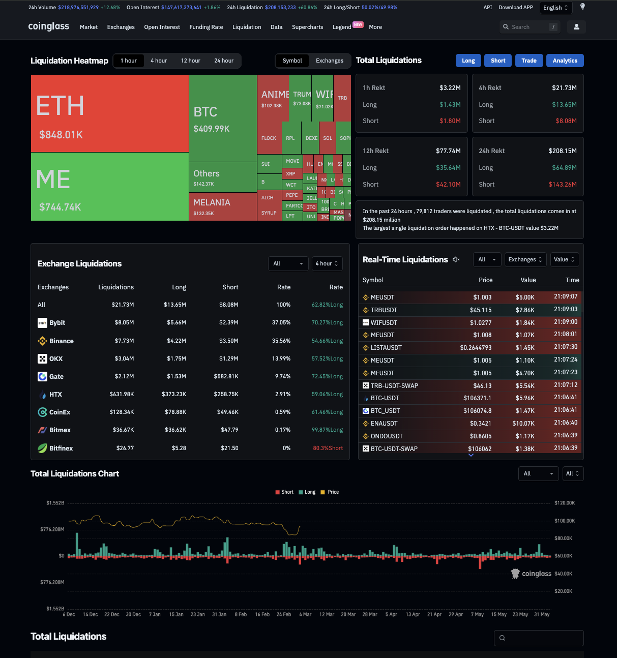
CoinGlass's own explainer states that the chart predicts where liquidation levels are likely to begin, not where they will end, and that the actual number of liquidations “will be fewer”. Size must be read relative to other levels on the same screen.
CoinGlass heatmap explainer, observed 27 July 2026
The controls that change what you see
Five controls sit between the underlying estimate and the image on your screen, all confirmed live on 27 July 2026. Change any one and the picture changes without a single number in the model changing.
| Control | Observed state | Effect on what you see |
|---|---|---|
| Model switch | Model 1 / 2 / 3 | Swaps the assumed leverage distribution. Different clusters, same open interest. |
| View tabs | Long / Short / Trade | Filters to one side of the book, or overlays trade activity. |
| Pair / Symbol | Toggle | Single contract versus symbol aggregated across venues. |
| Liquidity Threshold | Default 0.85 | Hides bands below the cut-off. A display filter, and the biggest source of screenshot disagreements. |
| Time range | Default 24 hour | Longer ranges accumulate more levels, so they look denser by construction. |
The full range selector, read off the live control rather than the page source, offers 12 hour, 24 hour, 3 day, 1 week, 1 month, 3 month, 6 month, 1 Year and 2 Year. The chart loads on 24 hour. A Prime badge sits on the gated controls.
| Capability | Free | Prime |
|---|---|---|
| Assets | BTC and ETH only | Full coverage |
| Models | Limited | Model 1, 2 and 3 |
| Auto-refresh | No | Yes |
| History | 6 and 12 month | Adds 24 month and beyond |
| Price | $0 | $28 / mo · $78 / qtr · $268 / yr |
Screenshots are not comparable by default
Two traders arguing about whether a level is “there” are often looking at different thresholds, models or ranges. Before accepting a heatmap image from a chat group, ask which three. If nobody knows, the image is decoration.
The missing auto-refresh deserves its own warning: a heatmap that does not refresh is a photograph of a surface that has already moved, because levels get consumed as price passes through them and new ones appear as open interest builds. Behaviour differs again on a phone — see our notes on the CoinGlass app and where to download it safely.
Heatmap, liquidation map, liquidity heatmap: three products, one confusion
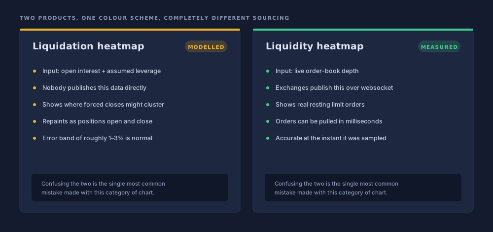
Three different charts, conflated constantly and usually at cost. The liquidation heatmap is a time-series surface of modelled clusters. The liquidation map is a point-in-time, leverage-bucketed view of cumulative estimated liquidation leverage above and below spot, closer to a depth chart. The liquidity heatmap is something else: the distribution of real resting orders in the book.
Modelled
Liquidation heatmap
Inferred positions, built from open interest plus an assumed leverage distribution. Unverifiable against any source, because no such source is published.
Measured
Liquidity heatmap
Real orders, built from order-book snapshots exchanges do publish. Orders can be pulled in an instant, but while they are there they are genuinely there.
An honest note about the naming
The map/heatmap distinction is real in the product — separate pages, separate API endpoints — but CoinGlass does not document it. Its own learn article on using liquidation maps uses “map” and “heatmap” interchangeably and draws no line between them. If the vendor's writing blurs the two, the confusion downstream is not the reader's fault.
The magnet thesis, and five reasons to hold it loosely
CoinGlass does endorse the magnet idea, and it deserves a fair statement before criticism. The company describes price ranges holding high liquidation levels as areas the market tends to gravitate toward, and calls them magnetic zones. The mechanism is not absurd: forced closures are market orders, market orders move price, and a cluster of them is a pocket of near-guaranteed flow. CoinGlass also advises pairing the map with other analysis rather than trading it standalone — the responsible half of the claim, and the half most often dropped.
Five objections keep the thesis in its place.
- Circularity. The model infers leverage from open interest, then the thesis predicts price will chase that inferred leverage. If the assumption is wrong, the magnet is an artefact of it rather than a feature of the market.
- Self-defeating popularity. With roughly a million app installs plus heavy web traffic, these levels are common knowledge. Widely known levels get front-run, and price may reverse before reaching the cluster.
- Survivorship in the anecdotes. A bright band being swept is memorable and gets screenshotted. The bands price never touches are forgotten. We found no published out-of-sample hit-rate study, in either direction.
- Magnitude is not direction. Even granting the effect, clusters routinely sit above and below spot at once. The surface says where flow would be, never which side goes first.
- The 1–3% error band. Placing a tight stop on a level with that much slack in it is not a coherent risk decision.
Where that leaves the magnet
Plausible as a mechanism, unmeasured as a claim. Read bright zones as a description of where the market is fragile, not a forecast that price will travel there.
Reading the data is step one. Seeing it move is step two.
Charts of open interest and funding make far more sense next to a live book you can actually watch.
Sponsored link. We may earn a commission if you open an account through it, at no extra cost to you. This is not investment advice, and leveraged products can lose you more than you deposit. See our disclaimer.
The undercount underneath the model
Even the measured stage is degraded, because exchanges throttle what they publish. CoinGlass says so plainly: displayed liquidation data sits below the real total because exchanges limit how often orders are pushed. Binance has capped updates at one per second since 24 April 2021. OKX imposed the same limit from September 2021. Bybit previously restricted its feed and has since begun publishing all liquidation orders.
Binance's developer documentation confirms the mechanism without euphemism: per symbol, only the largest single liquidation order inside each 1000-millisecond window is pushed. Everything else in that second is never broadcast. The worst distortion therefore lands during cascades — the moments people open the heatmap for.
| Source | Claim | Implied gap |
|---|---|---|
| Ben Zhou, Bybit CEO (Feb 2025) | Internal records showed $2.1bn while aggregators displayed $333m | ≈ 6.3× |
| Jeff Yan, Hyperliquid | Underreporting in extreme bursts could reach 100× | up to 100× |
| Vetle Lunde, K33 Research | Public liquidation feeds unreliable since 2021 | — |
| CoinGlass, 10 Oct 2025 | Reported $19bn+, estimated true scale $30–40bn | ≈ 1.6–2.1× |
The heatmap inherits all of it. Its sense of how much leverage clears at a given level rests on feeds that systematically underreport during volatility. CoinGlass carries a push-frequency warning on its liquidation pages — more disclosure than most aggregators offer, and no help in making the numbers whole.
Six ways people misread the heatmap
The recurring errors, in rough order of how much they cost.
Bands as real orders
The costliest mistake. Nothing here is an order — it is arithmetic on an assumption on an aggregate.
Brightness as money
Colour counts estimated levels relative to others on screen. Actual liquidations, CoinGlass says, will be fewer.
Wrong heatmap
Reading the liquidation heatmap as if it were the liquidity heatmap — modelled positions as visible depth.
Yesterday's screenshot
The surface repaints as open interest shifts and levels are consumed. A group-chat image carries no timestamp.
Stops on the level
A stop set exactly where the model drew a line, inside a 1–3% error band, in the region most prone to a sweep.
Mismatched settings
Comparing surfaces built with different models, thresholds or ranges as if they were one chart.
Worked example: 10 October 2025
The largest single-day liquidation event in crypto history is also the best stress test of everything above. The trigger was an announcement of 100% tariffs on Chinese imports plus export controls; the reaction was a cascade nearly every outlet reported by citing CoinGlass.
- Early Oct 2025Leverage builds
BTC sets an all-time high near $126,000. Open interest peaks at $235.9bn on 7 October — the conditions under which a heatmap looks most dramatic.
- 10 Oct, 21:15 UTCThe worst single minute
$3.21bn liquidated inside sixty seconds. Across forty minutes, $6.93bn, roughly $10.39bn per hour. Peak single-day derivatives volume hit $748bn.
- 10 Oct 2025Headline number
Over $19bn reported, 85–90% of it longs, more than 1.6 million accounts closed out. BTC fell 14.5% to $104,782; ETH lost 12.2% to $3,436.
- 10–11 Oct 2025Open interest evaporates
Over $70bn eliminated in two days. The input to stage one collapsed, so the whole modelled surface was rebuilt on different foundations.
- Annual reportCoinGlass discounts its own headline
The 2025 report put real scale at $30–40bn against the $19bn displayed — marking its most-cited number as a substantial undercount.
The platform's biggest moment of visibility was also the moment its limitations were least deniable, and CoinGlass chose to say so. The second lesson is quieter.
$19bn liquidated is not $19bn lost
Liquidation totals are notional position value, not realised trader losses. The $19bn describes the size of the positions closed, not money that vanished from accounts. Actual losses were far smaller. Headlines elide the difference, and so do people quoting them.
How a careful person actually uses it
As one input among several, for context rather than entries. The heatmap is good at one job: showing where the market is structurally fragile, meaning where forced flow could accelerate a move that began for some other reason. That is situational awareness. It is not a signal, and treating it as one inverts the tool.
- Record the settings with every screenshot: model, threshold, range, Pair or Symbol. Without them the image compares to nothing.
- Read it alongside open interest and funding, so you know whether leverage is building or unwinding.
- Reload before concluding anything, especially on the free tier, where nothing refreshes on its own.
- Treat bright zones as regions of possible volatility, not destinations price must visit.
- Assume the feeds understate reality, and understate it worst when the chart is most interesting.
Do not place a stop exactly on a modelled level
A band is an estimate carrying a 1–3% error range, in the price region most likely to produce a violent wick. A stop on that line sits inside noise the model cannot resolve. Where you set risk is your decision and nobody else's, but it should not be set by a colour.
Where these numbers come from
Controls, defaults, the range list and Prime pricing were read off the live coinglass.com pages on 27 July 2026. The relative-intensity caveat and magnetic-zone framing come from CoinGlass's learn articles; throttling figures from its public statements and Binance's developer documentation; the October 2025 numbers from CoinGlass's 2025 annual report, corroborated by CoinGecko, CCN and CoinDesk Research. We are not affiliated with CoinGlass. If you are signing in, read our notes on verifying the real login page first.
The CoinGlass liquidation heatmap is the best free view of where leverage plausibly sits, and honest enough to print its own caveats. As a fragility map it earns its place on a screen. As a set of price targets it is an assumption wearing the costume of a measurement — and the vendor says so in the small print.
Frequently asked questions
Is the CoinGlass liquidation heatmap real order data?
No. Exchanges do not publish the entry price or leverage of individual positions, so no aggregator can know where real liquidation orders sit. The heatmap estimates liquidation prices from open interest plus an assumed distribution of leverage, then applies standard margin arithmetic. The bright bands are modelled clusters, not resting orders and not a feed from any exchange risk engine.
What do the colours on the heatmap mean?
Colour runs from low-intensity purple to bright yellow, with yellow marking price levels where the model estimates a high concentration of potential liquidations. CoinGlass is explicit that this is a relative intensity indicator: brightness compares one level against another on the same screen. It is not a dollar figure, and CoinGlass says the number of liquidations that actually occur will be fewer than the levels shown.
What does the Liquidity Threshold slider do?
It filters out low-intensity bands so only clusters above the chosen cut-off remain visible. The default observed on the live page on 27 July 2026 was 0.85. Because the slider changes what is drawn rather than what is calculated, two people comparing screenshots at different threshold settings are looking at different pictures of the same underlying estimate. Check the setting before arguing about a level.
What is the difference between the liquidation heatmap and the liquidity heatmap?
The liquidation heatmap is modelled: it estimates where leveraged positions would be force-closed. The liquidity heatmap is measured: it plots the distribution of live resting orders in the order book. One is a guess about positions nobody can see, the other is a picture of orders anyone can see. They look similar and sit next to each other in the navigation, which is why people conflate them.
Do prices really get pulled toward liquidation clusters?
CoinGlass endorses the idea, describing high-liquidation price ranges as zones the market tends to gravitate toward, while advising that the map be combined with other analysis. We found no published out-of-sample study measuring how often price reaches a bright band versus how often it does not. Until such a study exists, treat the magnet effect as a plausible mechanism, not a measured hit rate.
Why do liquidation totals differ from one site to another?
Four reasons compound. Aggregators cover different sets of exchanges; they handle throttled liquidation feeds differently, with some grossing up estimates and some not; they treat coin-margined, stablecoin-margined and DEX perpetuals differently; and their twenty-four-hour windows start at different times. The totals are therefore not comparable across sites, and no single published figure is the correct one.
Is the liquidation heatmap free to use?
Partly. The free tier covers BTC and ETH only, with no automatic refresh, so the surface goes stale until you reload. CoinGlass Prime unlocks all three calculation models, wider asset coverage, extended history and auto-refresh, priced at $28 monthly, $78 quarterly or $268 annually as listed on 27 July 2026. Prime is separate from the API subscription; neither includes the other.
Which model should I use: Model 1, 2 or 3?
CoinGlass does not publish the leverage assumptions behind each model, so there is no principled way to choose from outside. The useful reading is the opposite one: the fact that three models coexist tells you no single assumption set is authoritative. Pick one, note which one you used, and never compare a Model 1 screenshot with a Model 3 screenshot as if they showed the same thing.
Keep reading